Tag: zerolens

  • Banner Ad Design: 14 Tips for Beginners

    Be honest – how many hours a day do you spend online? No need to answer, but from a marketing perspective, it’s clear that online advertising is the way to reach new customers. There are many, many ways to do this, not least of which is the humble banner ad! 

    Banner ads are often rectangular or banner shaped ads which appear on other websites. They’re great for boosting your traffic and reaching new audiences. However, internet users today are exposed to so much advertising that they have become “banner blind” and actively ignore all ads. Yup, If you’re new to design, creating a banner ad which grabs attention without irritating potential customers may seem like a daunting task. Fear not – we have 14 tips that will bring you from beginner to pro in no time.

    ~ Before you begin ~

    1. Get to know the software.

    If you’ve never designed a banner (or anything!) before, don’t worry – designing banner graphics is not as complicated as it sounds! The easiest option is Banner Snack, a paid design software which helps people with no artistic or coding skills create perfect banners. 

    Adobe Illustrator gives you a blank canvas, while Photoshop which helps you edit and embellish existing photos. To design HTML 5 files, try Google Web Designer and Adobe Animate

    Don’t worry if this is all new to you – there are plenty of resources online to help you get your design off the ground. 

    Play around, practice, and remember, design is a process. Your banner graphic doesn’t have to be perfect the first time

    1. Learn the principles of design.

    If you’re planning to grow your brand and design more ads in the future, it’s worth investing time in learning the basics of graphic design. To learn more about a particular area of design, consider taking a MOOC (Mass Online Open Course – usually free!). There are thousands to choose from, but courses such as Graphic Design, Ideas from the history of Graphic Design, Color Theory & Image Formats, Basic Elements of Design & Software and Communicate Your Ideas Through Storytelling & Design are just some great places to start!

    1. Start on paper.

    If you’re a good artist, start on paper. Sketch all your potential ideas. This is a “low fidelity” design (it can easily be erased, changed and played around with), so let your creativity flow. When you’re happy with your design, upload it to Illustrator to edit (see this handy tutorial from creativebloq). Keep all your sketches – who knows what they might inspire later on!
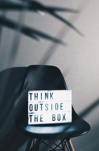
    1. Define your goal. 

    Design can reflect the tone of your ad. If it’s urgency – for example, a flash sale with unbelievable discounts – consider using flashing or bold colours to convey this. If your brand is all about calm, consider slower moving, gentler graphics. If you want to drive traffic to your site, you need a good “hook”, or attention-grabbing incentive to make people click. Think about what you want to achieve and centre your design around this.

    1. Do some market research.

    Pay more attention to the designs on banner ads you see everyday. Cover the logo, and see if you can guess which brand the ad is promoting – if so, that’s recognisable, consistent branding! Look at the ads your competitors have designed. What images, colours and associations are they using? Learn from them, but be original – don’t blend in or copy anyone’s ideas. You want your banner graphic design to stand out for all the right reasons. Make sure your brand is recognisable, and that most consumers would guess what kind of product it refers to.  

    ~ Technical details ~
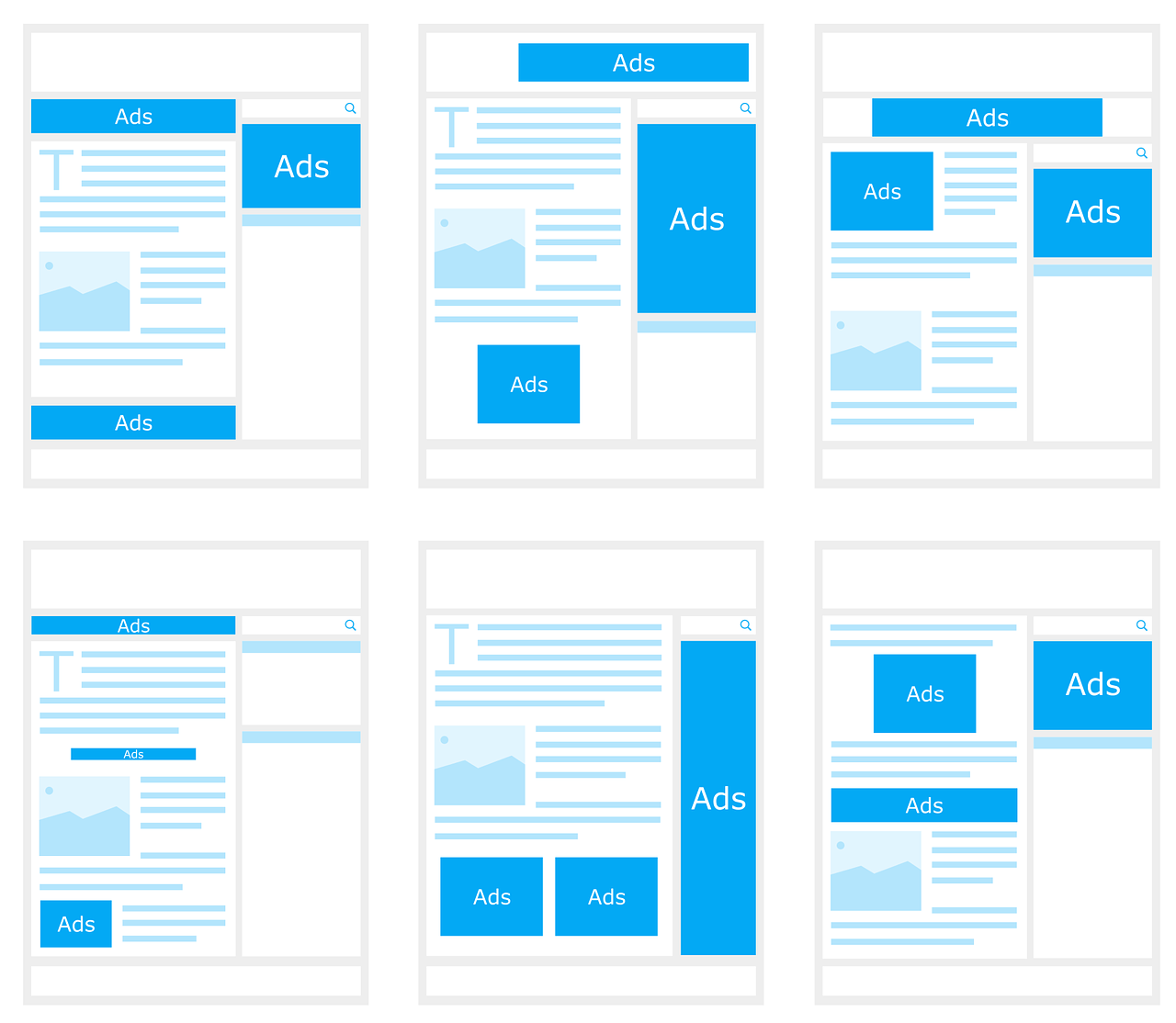
    1. Get the size right.

    Most websites offer “standard sizes” for advertising space. Keep your design to these dimensions to make sure it fits.

    Also, prefer file sizes small where possible. These designs load faster – most customers will have already scrolled past by the time a “stuck” ad loads! To find out what size your ads should be, check out this list of the 10 Highest Performing Google AdSense Banner Sizes. Try to design ads which fit in the dimensions and are eye-catching in the ad spaces offered on most websites:

    1. Consistent branding 

    Consistency is extremely important in marketing. Essentially, you should use the same elements and themes in all your banner designs, just tailoring them to fit the banner sizes pictured above. Consistency helps consumers recall and recognise your brand, as well as saving you time at the design stage! When brainstorming, stick to versatile slogans and designs which can be used across your marketing mix. 

    Your ads should use the same wording, fonts and imagery so far as possible. (Showcasing different products to different customers is possible with Google Ads – read “Google Ads for Beginners” to learn more!)

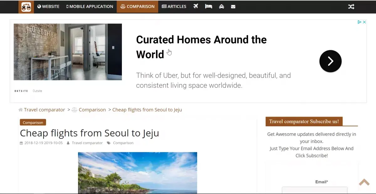
    Take a look at this seamless example of consistent branding:

    1. Structure is important.

    If you’re caught up with designing an amazing banner graphic, you might forget the obvious. Double check that your banner graphic design:

    • has a clear brand name and heading
    • Has a distinct call to action
    • Is easy to understand
    • Leads to the right place if clicked (if the customer clicks on a certain product, don’t send them to your “About” page, for example!)

    ~ Get designing! ~

    1. Colour

    Embrace colour theory when designing a banner graphic. Research suggests that 90% of “snap” consumer decisions (like clicking on a banner ad!) are related to colour and the associations implied. 

    Your design should reflect your brand’s values and use colours which convey the right emotion. Research colour associations in the culture(s) you are marketing to, and look at the designs used by dominant brands. 

    Source: TastyAd.com

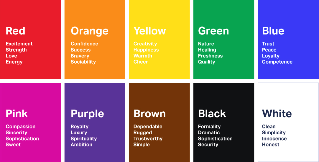
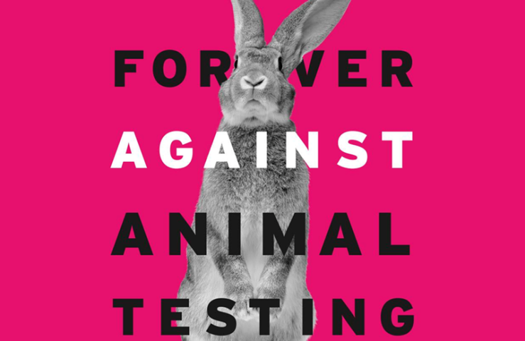
    Red suggests love, passion, appetite, speed, and urgency, which makes it a great colour for brands like Tinder, McDonald’s and Netflix, but not so for a mindfulness app or health brand. Grey is the preferred colour of minimalist technology brands like Apple – so choose grey to piggyback on their high-tech brand associations. Keep your target customer in mind at all times: colour preferences even vary between men and women.

    1. Images 

    If you plan to use images other than your brand logo in your banner graphic design, make sure you have legal copyrights to use them. As “hilarious” as stock photos may be, they aren’t worth getting into legal calamity over! Use your own images, or commission a graphic designer to create something unique to your brand.

    1. Use flashing and animations sparingly 

    Be extra memorable, not just extra. Do you remember those awful homepages people had in the ‘90s? Learn from their graphic design blunders. Avoid flashing hundreds of images – most people won’t look at your ad long enough to see the message at the end! Animations or graphics on banner designs should flash no more than 3 times, and end with a call to action (for example, flash three of your products, and end with “50% off now at X!”). Keep your design simple, minimalist and uncluttered for maximum effect.

    1. Fonts 

    Everyone hates Comic Sans – there’s even a movement to ban it. It’s awful letterfit and poor spacing are associated with childish, tasteless design. On the other hand, Helvetica is minimalist, professional, and arguably the world’s most loved font. It even starred in its own movie for all you design nerds out there.

    It’s important to keep your brand’s values and ad tone in mind when choosing a font. The key is to choose a font that is readable, recognisable and right for your brand. For something unique, Adobe Fonts and 1001 Free Fonts are a great place to start. If you choose different fonts for your logo and call to action, make sure they fit will together.

    Lastly: don’t use fonts smaller than 11px, unless it’s something unimportant to viewers, like a copyright declaration – great design is lost if potential customers have to stop and strain their eyes to see it!

    1. Frame your work.

    No, we don’t mean frame it, or put it on your refrigerator – but why not, if you want!

    Our eyes are naturally drawn to designs which stand out from the background or are “framed”. If the background of your design is white, put a 1-pixel wide grey border around the edges. This is too small for most people to notice, yet your design appears to stand out, even if the website’s background is also white! Avoid pop-ups or features which “spill” out onto the main page, as these will only irritate viewers.

    1. Last step: ensure your downright stunning banner graphic gets seen by the right people! 

    Reaching the right audience is crucial. It’s a good idea to show your design to potential customers and see how they rate it. What do they think the ad is for? Do they like the design? Would they stop to look at it in detail?

    Once you’re sure you’re on to a banner design winner, decide who you want to market to, and then, where you want to advertise. Google Ads will help you identify areas your ads could be improved, and A/B test your designs to find which one appeals to your target customer. You can also upload “assets” (design elements like images, phrases, etc) and let Google trial them in different combinations.  If you aren’t already using Google Ads, check out “Google Ads Guide for Beginners”. 

    So there’s more to Graphic Design than just MS Paint. If this overwhelms you, don’t worry! Everyone has to start somewhere. Start with the basics, and get comfortable with the software. Research associations and don’t be afraid to experiment before settling on design themes. Keep your brand’s vision and goals in mind, and you’re sure to create a banner graphic design you and your team can be proud of.

  • 11 Tips for Product Designers

    11 Tips for Product Designers

    Note: Product design used to mean designing physical products, but today it usually involves technology in some way, whether it’s designing an app, interface, or other service. 

    People underestimate the importance of good product design, because truly good design is invisible. Seamless, perfect, user-centred design fulfils all our needs without ever causing a problem. Bad design, on the other hand, is irritatingly memorable for all the wrong reasons. 

    The best product designers innovate, solve problems, and deliver the results of this to the user.

    Good products are intuitive and easy-to-use. If you have an amazing idea, how can you get started?

    Lean UX Design is a philosophy based on Toyota’s Lean Production technique. It approaches product design with a simple plan:

    1. Understand the problem.
    2. Brainstorm solutions.
    3. Create something that can be tested.
    4. Evaluate.

    .. and go back to step 1 if needs be!

    Let’s run through the steps and explore some tips to help you optimise your product design.

    Step 1: Understand the problem.

    Design is essentially problem solving. Ask yourself a lot of questions and design a product which answers them all.

    1. Research the market.

    You can’t have a business without a customer. Who is your target user? Research the market and see what your competitors are doing. Would you be able to sell this product?

    See what opportunities exist (gaps in the market – is it growing? Or saturated?) as well as threats (similar products or changes in trends). Understand market trends and what’s already been done. Where is the industry going? Design a product to fill the gap.

    1. Know your user and their needs.

    The first thing to think about is what context the customer would use your product in. Will they be listening to your traffic-update app while driving? Better install voice commands and make it simple to use hands-free. Is your health tech product for doctors or for patients to use at home? How much knowledge can you assume the user has? Beware of this when writing the instructions. 

    It’s safe to assume your customer is in a hurry and wants to spend as little time figuring out your product as possible. List the main tasks they will use the product for and make sure there aren’t any obvious design flaws – the Carelman Teapot is famous for its terrible product design.

    Anyone see the problem here??
    1. Offer something unique.

    Constantly evaluate your product’s features and try to offer some value your competitors do not. One of the infinite ways to do this would be creating a more environmentally friendly product, saving people a lot of time, or introducing a concept which reduces the need for other products. Google CEO Larry Page coined the phrase “toothbrush test” – if your product is unique, useful and needed at least once a day, it’s worth pursuing. Are your competitors failing to provide in one key area, or for a particular type of customer? 

    2. Brainstorm

    1. Keep it Simple.

    Less is more. Simple, intuitive products can be used by people of all ages, cultures, and backgrounds. Avoid “over-designing” or using unnecessarily complicated features. 

    Prioritise “function over features”. For registration, sign-in or payment forms, make sure your format is at least as simple as that of your competitor. Keep questions clear and require minimal work on the user’s part. Resist the temptation to do something clever or avant-garde. There are plenty of awful interfaces out there. Just look at this extremely impractical volume change interface that no one would ever want to use in public. 

    1. List  your WORST ideas.

    Have you come up with dumb ideas in the past? Now is your time to shine! Interaction Design recommends starting your brainstorming session by listing out the worst possible ideas. This will help you identify what customers do NOT want and problems you could avoid. You may come up with a good idea by accident, or at least think of some product features you wouldn’t have otherwise! If you’re designing a website or user interface, take a look at UserInYerFace. This one-page website is deliberately designed in the most user unfriendly way possible, and should give you an idea what NOT to do.

    1. Learn from the design pitfalls in your everyday life.

    Some people are product designers, but we’re all users, and we’ve all had a frustrating experience with a product. Is there a service you closed your account with? Did you delete an app because it was so hard to navigate? What brands do you avoid? Why? When you’re researching or ordering a product online, evaluate the website’s ease-of-use. Make a list of all the frustrating or other off-putting experiences you encounter as a user, and learn from these designer’s mistakes. How will your product do better? This video from a disgruntled customer gives examples of poor design on well-known online services:

    1. Broaden your perspective.

    Read, research and upskill using books, podcasts, and blogs. Learn as much as you can about areas such as web design, psychology, business, engineering, graphic design, and related industries. Great ideas, or at least, new perspectives, should come naturally. This will also help you understand team members at other stages of the product life cycle. Learn to “design for manufacturing and assembly” – some amazing ideas are just not possible from an engineering point of view. 

    1. Collaborate. 

    People who work in different industries can have different ways of looking at the world and organising ideas. Diversity is an asset, so learn from other people’s perspectives. Hubspot actually launched a product in only 11 weeks thanks to collaborative, agile product design teams. Hubspot  product designers are also “decentralized”, working as part of a team with non-designers. This encourages communication, and working together from the get-go helps avoid problems later on.

    1. Get to work!

    Rome wasn’t built in a day. If you have an idea, start small and put pen to paper. You can figure out the complicated aspects later on – just get to work and make something happen!

    Use sketches, diagrams and blueprints to design your products. For user interfaces, use UXPin, which lets you easily create mockups. Draw wireframes (pictured below), and explore different ways of laying out your app. Early concepts are called “low fidelity designs” because they can easily be changed, built on, and developed. Don’t be afraid to make mistakes, and dive right in.


    Step 3: Create something that can be tested

    Bring your idea to life with a mockup or prototype. Testing it will help you avoid problems later on. Optimising for usability now will help users get the most out of your product design.

    1. Understand how consumers perceive your product.

    You can’t always predict what problems users will encounter. Understand the “User Mental Model” – the user’s perception of the product and what it’s used for. Show the product to someone who isn’t familiar with it. Ask them what words they associate with it, how they think it’s used (if they guess right, your design is intuitive!), and what they would use it for.  

    1. Invite target customers to test the product

    Conduct online surveys, interviews, or Beta Tests. Ask your target customer to do a task (i.e, find and purchase a product on the app) and note what difficulties they encounter. How long did they take? Would they recommend it to a friend? 

    Identify areas they might find frustrating. Think about what else they might try to do (save to a wishlist for later? Send to a friend? Read reviews) and aim to make this as easy as possible.

    Interestingly, most men can’t guess what women’s beauty products are for. Choose testers who are prospective customers for optimum results.

    4. Evaluate.

    Pro-tip: It’s easier and cheaper to make changes early on. Avoid the “sunk cost fallacy” and don’t waste time finishing a flawed product design just because you’ve spent a lot of time on it. Instead…

    1. Embrace Responsive Design and learn from ***constructive criticism***.

    Stay humble, and as Don Norman says, “accept human behaviour the way it is”. A product idea could be amazing, but it will never be recognised as such if it’s so difficult to use that people don’t buy it.

    If your target customer doesn’t understand something, take it as a sign that a lot of others won’t either. Even if you’re proud of your design, accept that because you created it, you automatically understand it. A survey by User Testing, a company offers live feedback from potential customers, found that while 75% of companies believe they’re customer centric, only 25% of customers agree! 

    The best piece of advice to take from this article is to keep an open mind and learn from your mistakes. Very few people create an amazing, world-changing product design on their first attempt. Where did you go wrong in the past? Don’t dwell on mistakes, just learn something that you can apply in the future. Once your product is launched, invite feedback, and make sure it’s easy for customers to get in touch in-app or online and communicate any problems they have. 

    Take all these into account for any future product design projects, and you’ll be well on your way to becoming a great product designer.

    Have you designed a product? What did you learn from the experience? What should first-time product designers keep in mind? 

    And.. what are the best and worst product designs or user interfaces you’ve seen? 

    Share your thoughts in the comments! 🙂

  • Ambient Marketing: 11 Examples

    Ambient Marketing: 11 Examples

    What is Ambient Marketing?

    Ambient marketing is a marketing concept which uses non traditional ad space to promote brands in a memorable, real-world way. “Ambient” refers to everything in your immediate environment – in a city, this could be anything from the pavement and walls to benches, escalators and everyday objects. Ambient marketing is often related to OOH (Out-of-Home) or outdoor advertising, but includes objects, too.

    At first, ambient marketing was limited to things like blimps or projecting images on to buildings, but it wasn’t long until “everything” became ad space. Lamp posts, shopping trolleys, escalators, you name it, someone has an ad there! 

    Leaving a lasting impression, creating buzz, and inspiring photo ops are just some of the goals of ambient marketing!

    Read ahead to see how well-known brands have used ambient marketing in cities across the world.

    Ambient Marketing #101: Everything is ad space

    Clearly, Ambient marketing sees everything as potential ad space, including banal items like bus stops and benches. Someone realised wooden benches look kind of like a KitKat, and the famous campaign was born.

    https://www.facebook.com/solidkitkat/photos/its-a-freakin-kit-kat-bench/1085314798152465/

    Even tiny objects can be used for ambient marketing. Many companies use beer mats to promote their brands (we have to give whoever started this some credit – there’s no better place to promote alcoholic drinks than in a bar!), and Irish stout brand Guinness even created “Christmas postcard beer mats”, retro beer mats featuring well-known bars and feel-good messages which Irish pubgoers can mail to friends abroad, using novelty Guinness mailboxes, of course. 

     Giant objects

    “Go big or go home” is sometimes the name of the game in ambient marketing. Most people feel so bombarded with ads that companies have to go the extra mile to grab their attention – and what better way to do this than with an enormous, blimp-size object planted right in their line of view? The UK National Lottery sent six giant lottery balls floating down the River Thames in London in 2013 to remind people to play the lottery.  

    For better or worse, giant objects are definitely one of the most memorable forms of ambient marketing!

    However, some campaigns attract criticism. Some people say they ruin the historic character of cities and are just plain ugly. Unlike the installations or benches, these generally don’t serve any purpose other than marketing, and are unlikely to be recycled. An example is Bounty’s “make small work of big spills” campaign in the USA.

    Unusual objects

    Bags and vehicles make use of space the company already “owns”, but some ambient marketers go one step further – guerilla marketing. Guerilla marketing follows no rules and uses controversial methods and publicity stunts which some people may find over-the-top or inappropriate. It relies on the element of surprise and provokes curiosity by placing unusual objects in mundane everyday environments.

     It sometimes isn’t immediately obvious what the advertisement is for, so onlookers need to read accompanying ads to figure out what they’ve just seen. Lay’s chips Canada used this ambient marketing technique to promote the fact that their ingredients are sourced not far from the city.

    Different people react differently to these kind of ads – some think it’s like a vulgar, commercial form of modern art, but others think it brings imagination to otherwise boring urban landscapes. DKNY’s “Explore Your City” campaign in 2008 was widely criticized for planting “eyesore” orange bicycles on New York street corners and for tastelessly copying the existing Ghost Bike social marketing campaign.

    Installations

    Full-on installations are an increasingly popular option for big-budget ambient marketers, or anyone with an innovative concept to demonstrate. It’s the next generation of product demos and stalls which encourage potential customers to try out products.

    IBM’s “Smart Ideas for Smarter Cities” campaign provided innovative real-world solutions such as ramps and rain shelters – which most people agree are useful, as well as memorable. IBM uses the installations to demonstrate their concept, as well as their commitment to simplicity and problem solving. 

    This is a great way to communicate with the exact person who could benefit from your product, as well as create positive associations and brand awareness. Other brands such as Volvo use installations as a way of framing their brand as “fun” and getting involved in the community.

    https://www.youtube.com/watch?v=SByymar3bds

    Projections & holograms

    Less intrusive than giant objects, this is one of the more oldschool ambient marketing techniques, let’s take a look at projections and holograms. These bring your product to life and tick all the ambient marketing boxes: memorable, unique, and instagrammable! World Wildlife Foundation called for an end to illegal animal trafficking by “releasing” a giant hologram of an elephant on the streets of London, England in 2018. 

    Interactive experiences

    Experiential marketing can tie in well with ambient marketing. Companies offer memorable interactive experiences for customers, like the IKEA Sleepover or the Smirnoff comic book party. However, ambient marketers have hidden some experiences in the everyday environment. Coco-Cola’s “Happiness Machine” invites bored people waiting at Swedish bus stops to get a taste of summer.

    Promoting social change with everyday objects

    Charitable organisations and public health initiatives have used ambient marketing to get people thinking about their causes. Canadian non-profit organisation Raising the Roof created a poster campaign to raise awareness of homelessness and encourage viewers to reflect on their attitudes to homeless people. 

    While extremely minimalist, these posters speak volumes. They seem to blend seamlessly into the environment, but leave a lasting impression on anyone who stops to read them – a perfect example of ambient marketing!

    Other campaigns use everyday objects to draw people’s attention to issues such as sustainability. WWF designed an eye-catching paper towel dispenser to make people aware of waste and its effect on the rainforest.

    Source

    Sticker marketing 

    Small is beautiful. Stickers are another classic example of ambient marketing. This is perfect for small and niche brands – stickers are very cheap to produce, and the kind of places you typically see them are free and open to all. Stickers are an uncontroversial form of ambient marketing – they add character to grey walls, lamp posts and bus stops which could use some colour!  However, designing a sticker which will “stick out” on a crowded wall will be a challenge.

    Source

    Stickers could also be combined with street art, graffiti and stencils to communicate an edgy, creative brand – this fits the vibe of a trendy neighbourhood much more than a billboard does!

    Bagvertising

    “Bagvertising”, or designing one-of-a-kind, eye-catching branded bags, is an underrated form of ambient marketing. As more and more consumers prefer to use reusable tote bags, brands are investing in unique, quality designs which will be seen again and again by other shoppers. 

    The design should have character and convey something about your brand or product. Bulgarian beer brand Shumensko has been using this distinctive bag since 2009, and it is still one of the most commonly-cited examples of ambient marketing on the internet. 

    The bag looks like a crate of beer, and might put the idea of grabbing some cold ones in passerby’s minds. An added bonus: it integrates well with the brand’s other campaigns, using the same font and colours. Being distinctive and standing out is key in a market where consumers have so many brands to choose from.

    Vehicles are moving advertisements

    Advertising on public transport is not a new technique, but ambient marketers take it a step further by using public transport itself as a medium. Copenhagen Zoo’s ads look like something from an action movie and are sure to stand out in an otherwise mundane urban setting. This is a profitable strategy for a local advertiser – presumably anyone who sees a Copenhagen city bus is already in Copenhagen and a potential customer for the zoo!

    Similarly, some companies use their transit vehicles to promote the brand on the road. Innocent Smoothies “grassy van” is definitely eye-catching and grabs the attention of passers-by, as well as drivers. Its grassy-look communicates the brand’s commitment to natural, good old-fashioned ingredients, which integrates well with Innocent’s brand values. 

    “Invisible” branding: the future of ambient marketing?

    As we’ve seen, doing things differently is the future. “Invisible” branding is a new but ingenious concept in ambient marketing.

    Source

    Although the billboard doesn’t mention McDonald’s, it lists out the ingredients in a burger – substituting minimalist typeface for images. McDonald’s is a major global brand and can rely on “reminder marketing”. This is a frightening realisation for some – yes, even the most savvy, skeptical people have absorbed brand associations without realising it!

    Another example of “invisible” branding is Coco-Cola’s ad, which doesn’t even feature a Coke bottle – your brain’s associate capacities do the work. 

    Of course, these are just some of the ambient marketing techniques being used all around the world. With more and more competition, companies are getting creative, and campaigns change by the season. 

    What are the best (or worst) ambient marketing campaigns you have seen? What do you consider the most effective form of ambient marketing? What would you do differently? 

    Share your thoughts in the comments! 🙂

  • Advertising on Google: A Beginner’s Guide

    Advertising on Google: A Beginner’s Guide

    [ Published on Zerolens ]

    People conduct 5.6 billion searches on Google everyday. Yes – every DAY! 

    With 90% of the market share, Google is the most widely used search engine in most countries, and the first place most people look for products and services.

    Whether you’re looking to grow locally or globally, making sure your brand is visible on Google is the fastest way to grow your customer base

    The good news: Google Ads’ intuitive interface has made promoting your brand online easier than ever. 

    Machine learning and algorithms do a lot of the heavy lifting. To get started, all you have to do is choose your goal (more clicks? Leads? Sales?), what kind(s) of ad campaign to run, and how much you want to spend. If you’re new to online advertising, this may seem a little overwhelming – so let’s start with the basics.

    Where can I advertise on Google?

    There are 5 main types of Ads on Google:

    Search – These are ads that appear when people search for something on Google. Google’s crawlers (a programme that “crawls” the internet looking for websites to add to Google’s directory – contrary to popular belief, Google doesn’t actually own the internet, so you aren’t automatically listed!) usually find and “rank” websites based on how relevant they are to the “keyword” searched. The best quality websites appear closer to the top of the Search English Results Page (SERP)

    However, you can get one step ahead by taking out a “Search Ad”, and guaranteeing your site will appear at the top. 67% of people click on one of the first 5 search results, and 32% click on the first one, so it’s definitely worth paying more to appear before your competitors! 

    As you can see, Ads appear at the top of the page, and have the added advantage of not “looking” too much like an ad. They consist of a link, title and description, like any other search engine result.

    Display – Have you ever been reading the news online when suddenly you see an ad for a product you hovered over.. A week ago? This was a Google Display Ad.

    Over 2 million websites, including many online stores, blogging platforms and news sites, are part of the Google “Display Network”. This means they offer their “ad space” to Google, which then uses machine learning and algorithms to personalise the ads for each user. The Google Display network is estimated to reach over 90% of internet users, so this is a great way to reach new audiences, as well as remind old customers that you’re still there.

    The ads you see are related to your Google search history and interests. Ads can be adjusted to only appear to local or regional users, to a certain age group, to parents (for children’s products), or to those who work in certain industries. 

    If designing ads isn’t your thing, display ads could still be a great option for you. Just upload your “assets” (images, headlines, logos, videos, descriptions, etc) and Google will create a “responsive display ad”, an automatically-generated ad. Google Ads uses machine learning to test out different combinations and “optimise” your ad – i.e, figure out which look gets you the most clicks.

    Shopping Ads

    Formerly known as “Google Product Search”, Google Shopping enables shoppers to search for a particular item, and then compare prices and offerings from a range of stores. Basically, it’s a Google search engine for stores. This makes shopping easier for customers, and it’s also a great way to reach new audiences, promote your brand, and drive traffic to your website. The ads appear whenever someone searches for the product on Google, as well as in Google Images or on Partner Sites. 

    Users can also click the “Shopping” tab to browse all Google Shopping Ads.

    Google knows your location and prioritises ads from companies in the searcher’s region, or with products which match your interests.

    Google Ads is simple to use, and Shopping ads are no exception – just upload your product data (photo, title, price, store name, etc) and create a campaign. You can group your products and list their attributes to make sure the right customer finds them. You can also access data on how many clicks your ads receive, or how many “impressions” (potential customers viewing your product for 10 seconds or more). 

    Video

    You know the ads that play before the video on Youtube? Or those random videos that pop up on the side of other sites? These are Google Video Ads, and they appear on Youtube (owned by Google!), or as “Outstream Ads” on partner sites.

    If you already have product videos, demonstrations, or other branded content, consider a Video campaign. 6-second Bumper ads are a great option for raising awareness or reminding customers of your brand, and their short length means this is a good option for those of us with less movie-directing experience.

    Here are some examples:

    https://www.youtube.com/watch?v=-FBiSOXGV4g&list=PLlXZh4sJtb8FeCuXyZ90OyUCkpfzs1GtI&index=13&t=0s

    Google App Campaign

    Have you ever seen a promotional video for an app with an “install” button right in the ad? This is an App Ad. 85% of mobile users prefer apps to mobile sites, so it makes sense to invest in promoting your app. These ads then appear on Google Search (as an ad at the top of the page, with an added “install” button), in Google Play, on Youtube, and across the Display Network.

    You don’t need to design individual ads. Just upload your assets, such as text, description, photos, videos, and any HTML5 assets. Google’s systems test different combinations and go with those which get the most clicks. 

    A notable difference between App Campaigns and other Google Ads is the variety of campaign types available. You can select a campaign designed to get more installs (great for new apps), to drive app usage among people who’ve already installed, or to encourage a specific in-app action (e.g, purchases). 

    Sounds cool – how do I start a Google Ads Campaign?

    Go to Google Ads and register. Start a campaign, sort your products into ad groups and assign the  keywords you want associated with each. Google’s Keyword Planner explains how often each keyword is searched. Use MOZ Keyword Explorer to see which related keywords could help boost your website traffic.

    How do I decide what to spend?

    This is where it gets a little more complicated!

    Google has complex algorithms which decide which ad will appear at any given time. The process is known as an ad auction and can seem quite daunting to a newbie. Luckily, you can harness the power of Google data and select “automated bidding”. You decide how much you want to spend per day, per campaign, or per keyword, and Google does the rest

    Google’s algorithms remove human error, and automated bidding frees up your time to focus on developing a strategy or other areas of your business.

    Strategies

    Whether you’re looking for more impressions (views), clicks, or sales, Google can recommend a strategy for you.  Common strategies include “maximise clicks”, “maximise conversions”, or “Target return on ad spend” (ROAS). 

    Your budget is entirely in your control, and you “pay-per-click” – this is arguably much better value than real-world advertising, where you pay regardless of how many people interact with your ad! 

    [ Image 6: Pay-per-click Source]

    There’s also a remarketing option: you can upload your customer data or a list of previous customers, and target them through “remarketing”, or you can reach “similar audiences”, people who have things in common with your existing customers. As they say, Google knows everything!

    Use Google Ads’ data to grow your business

    Google processes over 20 petabytes of data per day, and some of its findings are bound to help your business. Here are just some of the metrics you could use to grow your business:

     “Bid Simulator”: Use Google’s data to try out “what-if” scenarios and see how you could have done better, e.g, how many more views you would have gotten if your budget was €0.10 higher. 

    First Page Bid Estimate”: reveal exactly how much you need to bid to put your ad on the much-coveted first page of Google search results.

    Optimisation score: Google will constantly evaluate how your ads perform and give feedback on how you could optimise campaigns. If your score is 100, this means you’re advertising at maximum potential! 

    Quality Score: Ads with a higher rank will appear higher on the search results page and are more likely to win auctions – i.e, Google will show these ads rather than their competitors’. To improve your Quality score, work on your landing page experience (how usable your website is) and relevance to the keyword searched. 

    Important note: Google prioritises user experience, so having awesome content is more important than having a bank-breaking budget!

    Although this article gives a good overview, advertising on Google can be a full-time job, and there’s a lot of know-how involved in fully optimising your campaign. If you aren’t already  “Google Ads Certified”, take the free online courses at Google SkillShop and you’ll be an expert in no time!

    That’s it for today. Have you advertised on Google before? What tips would you offer to someone starting out? What’s the coolest feature you’ve discovered on Google Ads? Share your experience in the comments 🙂

  • 5 Societal Marketing Campaigns You Need to Know About

    5 Societal Marketing Campaigns You Need to Know About

    [Published on Zerolens]

    Societal Marketing is a hot topic these days – but what is it?

    Societal Marketing is a marketing concept which focuses on the social, environmental or other “good” associated with a product or company. Societal marketing is a fantastic opportunity to communicate your brand’s values, what you stand for, and the change you’re striving towards. 

    Societal Marketing stems from the idea that companies should meet the target market’s needs with the added value of contributing some “good” to wider society. Products shouldn’t just make money for the company, they should innovate and improve the health or wellbeing of consumers, the community, the environment, or the wider world.

    Closely related to societal marketing is the concept of the “triple bottom line” – measuring a company’s success in terms of its social and environmental, as well as economic impacts.

    It’s important not to confuse societal marketing with social marketing – which is promoting or raising awareness of a cause entirely for social good, for example, a campaign to stop smoking or speeding. Marketing for a charity or non-profit also does not count as societal marketing.

    Societal marketing is the act of communicating the added social dimension of a for-profit product or service.

    Why Societal Marketing?

    Consumers want “more” than just a product. They want to resonate with your brand’s values and feel they’re contributing towards something meaningful. Today’s consumers are increasingly concerned about the environmental and ethical implications of their purchases, and The Nielsen Global Survey of Corporate Social Responsibility even found that more than half of consumers are willing to pay more for products and services provided by companies with a “positive social and environmental impact”. Consumers “vote with their wallet”, and want to support companies and causes deserving of their money. 

    There’s a big gap in the market for innovative products which meet the consumer’s needs while also contributing something of value in the wider social context. As consumers become more worried about our planet’s future, creating sustainable products and business models, and using societal marketing to communicate the “good” done, is more important than ever before!

    What are some examples of Societal Marketing?

    Brands can communicate socially conscious values in a number of ways. Anything that contributes to your public image is technically marketing – from your social media presence, to your packaging or PR! Societal Marketing is the act of communicating the “good” associated with your product. Read on for 5 examples of societal marketing done well:

    Product innovations which benefit the environment, the consumer, and the company 

    With almost 1,000 stores worldwide, Lush is one of the world’s best-loved cosmetics retailers with a sustainable focus. Lush doesn’t test on animals, uses only  vegetarian or “vegan” products, and innovates to minimise packaging. 

    In 2017, the company went one step further and introduced “Naked” or packaging-free products, from solid shower gels, moisturisers, shampoo bars and bath bombs. Now, 35% of all Lush products are unpackaged, and customers in the UK can even visit a packaging-free store

    These products no doubt appeal to the brand’s existing eco-conscious consumers, as well as offering a unique experience for a variety-seeking consumer. Their unusual look attracts attention for all the right reasons. From the business’ point of view, this is a great innovation. Not only does this product align with Lush’s zero-waste values, it reduces packaging and production costs for the company. It’s a win-win situation!

    Similar examples include OWA’s Moondust Collection, a “powder shampoo”, which lasts far longer than traditional liquid shampoo. As liquid shampoo is 75-90% water, it is production intensive and expensive to transport. Selling the powder directly to consumers cuts down all these costs, reduces emissions, and has two tangible benefits for the consumer: saving money, and knowing they have made the more environmentally-friendly choice.

    “One-for-one” model

    One of the most well-known examples of social entrepreneurship, TOMS is a footwear and accessory company famous for its “one for all” business model. TOMS pledges to “match” every pair of shoes bought by donating a pair to children in developing countries, and the company expects to donate 100 million pairs of shoes by 2020.

    TOMS presents itself as an ethical option for the growing number of consumers frustrated by fast fashion. There’s definitely a “feel good” factor here, as consumers can contribute to a meaningful cause just by choosing TOMS. The brand also uses their social media channels to raise awareness of poverty in developing countries, as well as communicate the impact of their project in communities.

    Other examples of the “one-for-one” model are Codecademy, an online education platform which provides coding courses, offering free premium memberships to new users made unemployed by the COVID-19 crisis. Also operating with this model is Figs. This lifestyle company makes premium medical apparel and matches every purchase of scrubs by donating a pair to in-need healthcare workers.

    Circular Economy innovations

    The “circular economy” is a concept which aims to eliminate waste and reuse resources again for different purposes. Companies find a way to recycle any waste generated, or otherwise offset the environmental damage done. As well as helping save the world, closing the loop usually saves money and solidifies a company’s “green” image.

    Ben & Jerry’s is one of the world’s most iconic ice-cream brands and is known for its strong social orientation – everything from supporting gay marriage campaigns to fairtrade and partnering with organisations such as WWF.

    Their commercials and packaging encourage consumers to go online and read more about their eco-friendly innovations – from installing solar arrays and a biodigester that turns waste into clean energy to power their factories, to developing more energy-efficient freezers.

    Other examples include Enerkem, a technology which extracts carbon from waste that can’t be recycled, and turns it into usable biofuels like methanol and ethanol. Lego’s “botanical elements” are made from responsibly-sourced sugarcane rather than traditional plastic.

    Social Activism

    Considered one of the world’s most socially responsible brands, The Body Shop promotes causes in store and uses their packaging to raise awareness of issues. One of the brand’s biggest selling points is its commitment to “Community Trade”, ensuring safe working conditions and pay equality for workers. In 2017, The Body Shop launched their biggest ever societal marketing campaign: Forever Against Animal Testing.

    The Body Shop brought an 8000-signature petition to the UN to ban animal testing worldwide. As the first global cosmetics company to fight animal testing, promoting massive campaigns like this creates a sense of loyalty among eco-conscious consumers. Consumers can feel they’re “sponsoring” the campaign by buying products, and the brand takes responsibility for a social issue in the industry. This is a very solid example of aligning social activism with a brand’s values.

    Other examples: Nike’s UNITED campaign, which promotes racial equality and equal access to sports, recently announced its commitment to donate $40 million dollars to charities supporting the black community in the USA.

    Anti-consumerism: Greener, simpler, and more thoughtful

    Anti-consumerism is the belief that people don’t have to be “consumers”. We should prioritise buying high quality products, and only buy what we really need. Societal marketing is a way for minimalist brands to communicate how their product reduces the need for consumerism. 

    In 2011, outdoor wear brand Patagonia launched their “Don’t Buy This Jacket” campaign. It may seem counter-productive, as the ad features a Patagonia jacket and outlines the environmental cost of producing and shipping it to store – 135 litres of water and 20 pounds of carbon dioxide. 

    The ad encourages people to rethink their needs and avoid fast fashion by buying a “thoughtfully produced” and long-lasting jacket. Patagonia is essentially calling out brands which produce low quality, disposable products and contribute to waste. 

    This really appeals to customers who love the natural environment and value minimalism. Patagonia’s “Worn Wear” initiative extends a kind of lifetime warranty to customers, who are invited to send in products for free repairs if the brand’s online repair guides do not suffice. This is a great example of societal marketing – producing useful products with a quality and ethical advantage over competitors, which helps consumers save money and live a greener lifestyle.  

    As this attention-grabbing campaign actually increased sales by 30%, the campaign was a definite win for all three stakeholders in the triple bottom line.

    The oldest example of this type of marketing is Volkswagen’s 1955 ad for the “The Lemon” (Bug) which urges viewers to “think small”. The ad outlines that its superior, reliable design will make the car last longer than its competitors. 

    How could societal marketing work for me?

    Whether you’re thinking of bringing a new idea to the marketplace, societal marketing could be a worthwhile strategy for you.

    1. Think about the problem your product solves. Does it remove the need for something else? Does it make a process more environmentally friendly by using fewer resources? Many software products reduce the need for paper as well as saving time! If this is the case, use societal marketing to focus on your product’s innovative, problem-solving side and reach out to the people who will benefit from it.
    2. Choose causes that are relevant to your brand and that are meaningful to you and your consumer base. You don’t want to be accused of “greenwashing” or faking your commitment for PR! Look for organisations, initiatives or projects in the local community or wider world which share your values. Education initiatives or non-profits could potentially use your product.
    3. Organise events and communicate your commitment to the cause in an appropriate way. Events such as clothes swaps, charity fundraisers, or workshops may all be worth considering.

    .. And that’s a whistle stop tour of societal marketing and how it’s done!

    How do you feel about societal marketing? What are the best (or worst) examples of societal marketing you have seen? How could brands do societal marketing better? 

    Share your thoughts in the comments!