Digital transformation is about bringing together the right tools, people and strategies to create meaningful change – but what questions do we need to ask ourselves along the way?
We asked Bloom’s Engagement Manager Heike Poley to share bite-size key learnings from launching new concepts.
Design Thinking is a creative problem-solving approach that brings new value to customers and organizations, helping us challenge our assumptions and innovate in ways we never thought possible.
At Workshopper, we have found that Design Thinking workshops can drastically change the way we think about our products, consumers, and even processes. These workshops not only unearth true gem ideas, they help actualize team members, get them on board, and radically improve processes both now and in the future…
The range of questions we explore in Design Thinking workshops vary wildly – “what do our customers really want?” and “how can we make the recovery process more pleasant for patients?” are just two snappy examples.
In any case, the solution is roaming free and untamed on some distant, uncharted plain in our imagination. Design Thinking workshops unlock previously untapped creative potential – while keeping the customer and their needs front and center.
Let’s take a look at 8 unexpected benefits of this often groundbreaking process:
It challenges our assumptions and help us see things in new ways.
The very concept of an externally-facilitated workshop adds a new, unclouded lens to the problem. Bringing in a new stakeholder can stimulate fresh discussion and ideas in the group, and as the team explains or justifies their current ways of doing things to an outsider, they may identify holes and room for improvement. This challenging of norms and biases is the crucial first step in design thinking.
It helps unlock new creativity – in the most structured possible way.
The stereotype of designers as feckless creatives throwing paint at the wall couldn’t be further from the truth. Design Thinking seeks to lock down the most inspired, energetic parts of the creative process and apply a reliable, rigorous framework to deduce winning ideas. In Design Thinking workshops, you will agree on the key questions and problems ahead of time, and your facilitator will implement exercises to properly explore these -within a time limit. We’ve all had brainstorming meetings which go way off track, dwell far too long on lightweight problems, or speed ahead to an easy solution rather than really getting into the thick of the issue. Design Thinking reframes this process in a replicable way, which guarantees your questions are answered with maximum creativity – in a minimum amount of time.
It sparks bright new ideas – and ensures the perfect one doesn’t go unsaid.
“The best way to have a good idea is to have a lot of ideas.” – Linus Pauling
Most of us have already found that just bouncing your ideas off someone else may inspire an offshoot, redesign, or even a complete change of track. Design Thinking Workshops cultivate this creative spirit and leave no stone unturned in the search for the winning solution. Design Thinking is an inclusive concept which builds itself on the assumption that everyone’s unique perspective and experiences generate one-of-a-kind (and potentially groundbreaking) ideas. Our workshop exercises empower and encourage everyone to get thinking and share their thoughts with the group. The trial and error approach of unlocking and exploring every possible idea before narrowing it down to the clear winners can lead to amazing, unexpected successes. Even terrible ideas teach us something: what is it that we should NOT do?
It recenters customers at the heart of our design – and helps us rediscover why we do what we do.
Paul Rand famously said: “design is so simple. That’s why it’s complicated.”
When we spend our time working behind the scenes, we may forget the perspective of someone who has never used our product, or may not be aware of the full range of reasons they may need to use it. To help you refocus, Design Thinking workshops begin with a crucial (but simple!) exercise: empathizing with your user, and endeavoring to deliver a more human-centered design. Human-centered approaches – for example having the workshop participants live the customer’s experience and interact naturally with products or services – may help glean these “seemingly obvious” yet pivotal insights. These rethinks dispel assumptions and often spark ideas for future improvements, or entirely new concepts. The Design Thinking process identifies tangible pain points and develops the clear, actionable outputs we need to address them.
Interested in figuring out what simple solutions you may be missing? Read Workshopper’s Guide to Empathizing with your customer to discover a few exercises like “the 5 Whys” and “Beginner’s Mindset” to get you thinking.
It leads to a whole host of competitive advantages.
Executives are well aware that structured creative thinking is the key to unlocking new success – but they may be pleasantly surprised by just how much time, energy and money can be saved thanks to this streamlined process. The obvious benefits of Design Thinking are smarter, more thought-out products which truly address your customers’ needs (or go one step ahead and fulfill a nascent need). The Design Thinking process itself grants further savings in that it reduces time to market and saves a great deal of time on prototyping and development, thanks to its built-in feedback loops and troubleshooting.
It inspires and empowers new leadership & innovation.
The Design Thinking process actively involves employees across teams in the Design process and subsequent project – and creates massive buyin. Contributing their own ideas and fleshing out those of their colleagues heightens employees’ level of personal interest and investment in bringing the concept to life. At the end of the project, they can feel truly proud of their work and reflect on the new perspectives and learnings gained from such a hands-on role. This empowering experience instills valuable new skills and may inspire them to innovate and lead ideas in the future.
It fosters epic co-creation.
Design Thinking may reshape the way your organization solves problems, and the willingness for co-creation is one of the most welcome effects. Design Thinking puts interdisciplinary experts – and people of all different backgrounds and experiences – in the same room and on the same project. Instead of measuring individual success or focusing on their “own” work, they co-create and pool all ideas to ensure the final result reflects the very best of the group’s collective insights. The tangible result often inspires teams with the knowledge that “together”, they truly can achieve more, and may inspire new collaborative efforts in the future.
It facilitates enriched communication – now, and in the future.
An offshoot of this co-creation is improved communication, empathy and dialogue within the organization. This is a positive move toward breaking down silos and providing context between teams. New knowledge, perspectives, and experiences may also help employees gain new adaptability and insight to apply in their everyday role. Product designers with an insight into the development process, developers who understand what users hope to achieve with their product, and marketers who understand the technical ins and outs of the product they are selling, are just some of the many examples. New learning and feedback create an iterative process whereby the firm continually improves.
Conclusion
“Design Thinking is a mindset, not a toolkit or a series of steps”
Design Thinking doesn’t teach just one skill: it’s a whole new way of thinking, and this cultural and systematic change is felt across your entire organization.
Aside from getting your creative juices flowing, Design Thinking workshops fine-tune your ideation processes and hopefully inspire you to think outside the box in everything you do. Importantly, they empower employees to learn from one another and cooperate in ways they previously hadn’t thought possible. When you begin solving problems with Design Thinking, you never know what could come next – you may even discover a new guiding light or strategic goal to work toward.
Be honest – how many hours a day do you spend online? No need to answer, but from a marketing perspective, it’s clear that online advertising is the way to reach new customers. There are many, many ways to do this, not least of which is the humble banner ad!
Banner ads are often rectangular or banner shaped ads which appear on other websites. They’re great for boosting your traffic and reaching new audiences. However, internet users today are exposed to so much advertising that they have become “banner blind” and actively ignore all ads. Yup, If you’re new to design, creating a banner ad which grabs attention without irritating potential customers may seem like a daunting task. Fear not – we have 14 tips that will bring you from beginner to pro in no time.
~ Before you begin ~
Get to know the software.
If you’ve never designed a banner (or anything!) before, don’t worry – designing banner graphics is not as complicated as it sounds! The easiest option is Banner Snack, a paid design software which helps people with no artistic or coding skills create perfect banners.
If you’re a good artist, start on paper. Sketch all your potential ideas. This is a “low fidelity” design (it can easily be erased, changed and played around with), so let your creativity flow. When you’re happy with your design, upload it to Illustrator to edit (see this handy tutorial from creativebloq). Keep all your sketches – who knows what they might inspire later on!
Define your goal.
Design can reflect the tone of your ad. If it’s urgency – for example, a flash sale with unbelievable discounts – consider using flashing or bold colours to convey this. If your brand is all about calm, consider slower moving, gentler graphics. If you want to drive traffic to your site, you need a good “hook”, or attention-grabbing incentive to make people click. Think about what you want to achieve and centre your design around this.
Do some market research.
Pay more attention to the designs on banner ads you see everyday. Cover the logo, and see if you can guess which brand the ad is promoting – if so, that’s recognisable, consistent branding! Look at the ads your competitors have designed. What images, colours and associations are they using? Learn from them, but be original – don’t blend in or copy anyone’s ideas. You want your banner graphic design to stand out for all the right reasons. Make sure your brand is recognisable, and that most consumers would guess what kind of product it refers to.
~ Technical details ~
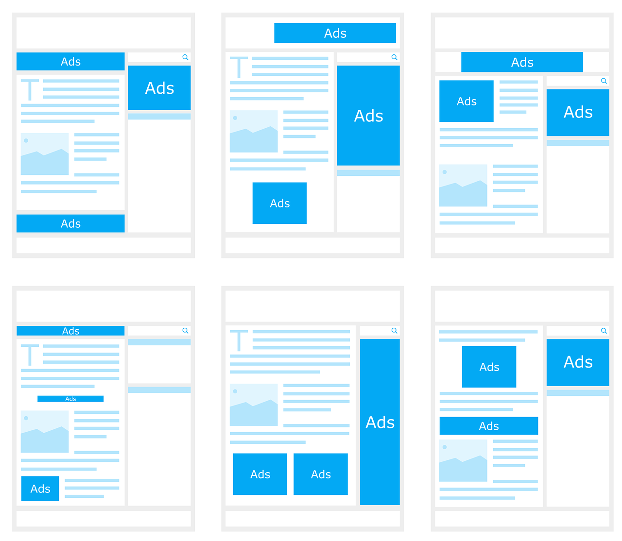
Get the size right.
Most websites offer “standard sizes” for advertising space. Keep your design to these dimensions to make sure it fits.
Also, prefer file sizes small where possible. These designs load faster – most customers will have already scrolled past by the time a “stuck” ad loads! To find out what size your ads should be, check out this list of the 10 Highest Performing Google AdSense Banner Sizes. Try to design ads which fit in the dimensions and are eye-catching in the ad spaces offered on most websites:
Consistent branding
Consistency is extremely important in marketing. Essentially, you should use the same elements and themes in all your banner designs, just tailoring them to fit the banner sizes pictured above. Consistency helps consumers recall and recognise your brand, as well as saving you time at the design stage! When brainstorming, stick to versatile slogans and designs which can be used across your marketing mix.
Your ads should use the same wording, fonts and imagery so far as possible. (Showcasing different products to different customers is possible with Google Ads – read “Google Ads for Beginners” to learn more!)
Take a look at this seamless example of consistent branding:
Structure is important.
If you’re caught up with designing an amazing banner graphic, you might forget the obvious. Double check that your banner graphic design:
has a clear brand name and heading
Has a distinct call to action
Is easy to understand
Leads to the right place if clicked (if the customer clicks on a certain product, don’t send them to your “About” page, for example!)
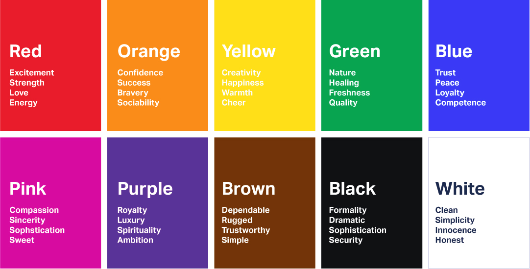
Your design should reflect your brand’s values and use colours which convey the right emotion. Research colour associations in the culture(s) you are marketing to, and look at the designs used by dominant brands.
Red suggests love, passion, appetite, speed, and urgency, which makes it a great colour for brands like Tinder, McDonald’s and Netflix, but not so for a mindfulness app or health brand. Grey is the preferred colour of minimalist technology brands like Apple – so choose grey to piggyback on their high-tech brand associations. Keep your target customer in mind at all times:colour preferences even vary between men and women.
Images
If you plan to use images other than your brand logo in your banner graphic design, make sure you have legal copyrights to use them. As “hilarious” as stock photos may be, they aren’t worth getting into legal calamity over! Use your own images, or commission a graphic designer to create something unique to your brand.
Use flashing and animations sparingly
Be extra memorable, not just extra. Do you remember those awful homepages people had in the ‘90s? Learn from their graphic design blunders. Avoid flashing hundreds of images – most people won’t look at your ad long enough to see the message at the end! Animations or graphics on banner designs should flash no more than 3 times, and end with a call to action (for example, flash three of your products, and end with “50% off now at X!”). Keep your design simple, minimalist and uncluttered for maximum effect.
Fonts
Everyone hates Comic Sans – there’s even a movement to ban it. It’s awful letterfit and poor spacing are associated with childish, tasteless design. On the other hand, Helvetica is minimalist, professional, and arguably the world’s most loved font. It even starred in its own movie for all you design nerds out there.
It’s important to keep your brand’s values and ad tone in mind when choosing a font. The key is to choose a font that is readable, recognisable and right for your brand. For something unique, Adobe Fonts and 1001 Free Fonts are a great place to start. If you choose different fonts for your logo and call to action, make sure they fit will together.
Lastly: don’t use fonts smaller than 11px, unless it’s something unimportant to viewers, like a copyright declaration – great design is lost if potential customers have to stop and strain their eyes to see it!
Frameyour work.
No, we don’t mean frame it, or put it on your refrigerator – but why not, if you want!
Our eyes are naturally drawn to designs which stand out from the background or are “framed”. If the background of your design is white, put a 1-pixel wide grey border around the edges. This is too small for most people to notice, yet your design appears to stand out, even if the website’s background is also white! Avoid pop-ups or features which “spill” out onto the main page, as these will only irritate viewers.
Last step: ensure your downright stunning banner graphic gets seen by the right people!
Reaching the right audience is crucial. It’s a good idea to show your design to potential customers and see how they rate it. What do they think the ad is for? Do they like the design? Would they stop to look at it in detail?
Once you’re sure you’re on to a banner design winner, decide who you want to market to, and then, where you want to advertise. Google Ads will help you identify areas your ads could be improved, and A/B test your designs to find which one appeals to your target customer. You can also upload “assets” (design elements like images, phrases, etc) and let Google trial them in different combinations. If you aren’t already using Google Ads, check out “Google Ads Guide for Beginners”.
So there’s more to Graphic Design than just MS Paint. If this overwhelms you, don’t worry! Everyone has to start somewhere. Start with the basics, and get comfortable with the software. Research associations and don’t be afraid to experiment before settling on design themes. Keep your brand’s vision and goals in mind, and you’re sure to create a banner graphic design you and your team can be proud of.
Note: Product design used to mean designing physical products, but today it usually involves technology in some way, whether it’s designing an app, interface, or other service.
People underestimate the importance of good product design, because truly gooddesign isinvisible. Seamless, perfect, user-centred design fulfils all our needs without ever causing a problem. Bad design, on the other hand, is irritatingly memorable for all the wrong reasons.
The best product designers innovate, solve problems, and deliver the results of this to the user.
Good products are intuitive and easy-to-use. If you have an amazing idea, how can you get started?
Lean UX Design is a philosophy based on Toyota’s Lean Production technique. It approaches product design with a simple plan:
Understand the problem.
Brainstorm solutions.
Create something that can be tested.
Evaluate.
.. and go back to step 1 if needs be!
Let’s run through the steps and explore some tips to help you optimise your product design.
Step 1: Understand the problem.
Design is essentially problem solving. Ask yourself a lot of questions and design a product which answers them all.
Research the market.
You can’t have a business without a customer. Who is your target user? Research the market and see what your competitors are doing. Would you be able to sell this product?
See what opportunities exist (gaps in the market – is it growing? Or saturated?) as well as threats (similar products or changes in trends). Understand market trends and what’s already been done. Where is the industry going? Design a product to fill the gap.
The first thing to think about is what context the customer would use your product in. Will they be listening to your traffic-update app while driving? Better install voice commands and make it simple to use hands-free. Is your health tech product for doctors or for patients to use at home? How much knowledge can you assume the user has? Beware of this when writing the instructions.
It’s safe to assume your customer is in a hurry and wants to spend as little time figuring out your product as possible. List the main tasks they will use the product for and make sure there aren’t any obvious design flaws – the Carelman Teapot is famous for its terrible product design.
Anyone see the problem here??
Offer something unique.
Constantly evaluate your product’s features and try to offer some value your competitors do not. One of the infinite ways to do this would be creating a more environmentally friendly product, saving people a lot of time, or introducing a concept which reduces the need for other products. Google CEO Larry Page coined the phrase “toothbrush test” – if your product is unique, useful and needed at least once a day, it’s worth pursuing. Are your competitors failing to provide in one key area, or for a particular type of customer?
2. Brainstorm
Keep it Simple.
Less is more. Simple, intuitive products can be used by people of all ages, cultures, and backgrounds. Avoid “over-designing” or using unnecessarily complicated features.
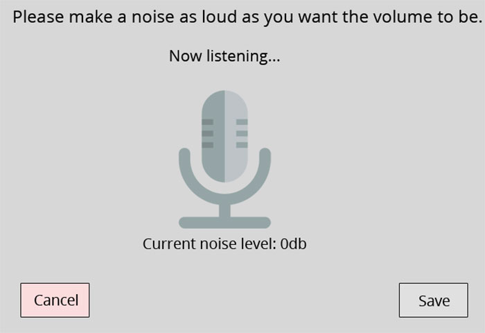
Prioritise “function over features”. For registration, sign-in or payment forms, make sure your format is at least as simple as that of your competitor. Keep questions clear and require minimal work on the user’s part. Resist the temptation to do something clever or avant-garde. There are plenty of awful interfaces out there. Just look at this extremely impractical volume change interface that no one would ever want to use in public.
List your WORST ideas.
Have you come up with dumb ideas in the past? Now is your time to shine! Interaction Design recommends starting your brainstorming session by listing out the worst possible ideas. This will help you identify what customers do NOT want and problems you could avoid. You may come up with a good idea by accident, or at least think of some product features you wouldn’t have otherwise! If you’re designing a website or user interface, take a look at UserInYerFace. This one-page website is deliberately designed in the most user unfriendly way possible, and should give you an idea what NOT to do.
Learn from the design pitfalls in your everyday life.
Some people are product designers, but we’re all users, and we’ve all had a frustrating experience with a product. Is there a service you closed your account with? Did you delete an app because it was so hard to navigate? What brands do you avoid? Why? When you’re researching or ordering a product online, evaluate the website’s ease-of-use. Make a list of all the frustrating or other off-putting experiences you encounter as a user, and learn from these designer’s mistakes. How will your product do better? This video from a disgruntled customer gives examples of poor design on well-known online services:
Broaden your perspective.
Read, research and upskill using books, podcasts, and blogs. Learn as much as you can about areas such as web design, psychology, business, engineering, graphic design, and related industries. Great ideas, or at least, new perspectives, should come naturally. This will also help you understand team members at other stages of the product life cycle. Learn to “design for manufacturing and assembly” – some amazing ideas are just not possible from an engineering point of view.
Collaborate.
People who work in different industries can have different ways of looking at the world and organising ideas. Diversity is an asset, so learn from other people’s perspectives. Hubspot actually launched a product in only 11 weeks thanks to collaborative, agile product design teams. Hubspot product designers are also “decentralized”, working as part of a team with non-designers. This encourages communication, and working together from the get-go helps avoid problems later on.
Get to work!
Rome wasn’t built in a day. If you have an idea, start small and put pen to paper. You can figure out the complicated aspects later on – just get to work and make something happen!
Use sketches, diagrams and blueprints to design your products. For user interfaces, use UXPin, which lets you easily create mockups. Draw wireframes (pictured below), and explore different ways of laying out your app. Early concepts are called “low fidelity designs” because they can easily be changed, built on, and developed. Don’t be afraid to make mistakes, and dive right in.
Bring your idea to life with a mockup or prototype. Testing it will help you avoid problems later on. Optimising for usability now will help users get the most out of your product design.
Understand how consumers perceive your product.
You can’t always predict what problems users will encounter. Understand the “User Mental Model” – the user’s perception of the product and what it’s used for. Show the product to someone who isn’t familiar with it. Ask them what words they associate with it, how they think it’s used (if they guess right, your design is intuitive!), and what they would use it for.
Invite target customers to test the product.
Conduct online surveys, interviews, or Beta Tests. Ask your target customer to do a task (i.e, find and purchase a product on the app) and note what difficulties they encounter. How long did they take? Would they recommend it to a friend?
Identify areas they might find frustrating. Think about what else they might try to do (save to a wishlist for later? Send to a friend? Read reviews) and aim to make this as easy as possible.
Interestingly, most men can’t guess what women’s beauty products are for. Choose testers who are prospective customers for optimum results.
4. Evaluate.
Pro-tip: It’s easier and cheaper to make changes early on. Avoid the “sunk cost fallacy” and don’t waste time finishing a flawed product design just because you’ve spent a lot of time on it. Instead…
Embrace Responsive Design and learn from ***constructive criticism***.
Stay humble, and as Don Norman says, “accept human behaviour the way it is”. A product idea could be amazing, but it will never be recognised as such if it’s so difficult to use that people don’t buy it.
If your target customer doesn’t understand something, take it as a sign that a lot of others won’t either. Even if you’re proud of your design, accept that because you created it, you automatically understand it. A survey by User Testing, a company offers live feedback from potential customers, found that while 75% of companies believe they’re customer centric, only 25% of customers agree!
The best piece of advice to take from this article is to keep an open mind and learn from your mistakes. Very few people create an amazing, world-changing product design on their first attempt. Where did you go wrong in the past? Don’t dwell on mistakes, just learn something that you can apply in the future. Once your product is launched, invite feedback, and make sure it’s easy for customers to get in touch in-app or online and communicate any problems they have.
Take all these into account for any future product design projects, and you’ll be well on your way to becoming a great product designer.
Have you designed a product? What did you learn from the experience? What should first-time product designers keep in mind?
And.. what are the best and worst product designs or user interfaces you’ve seen?
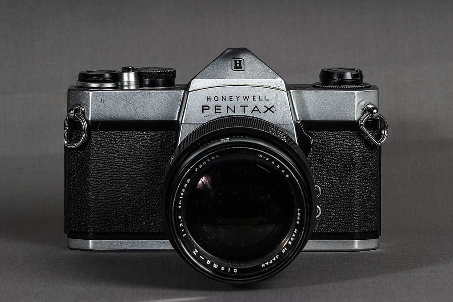
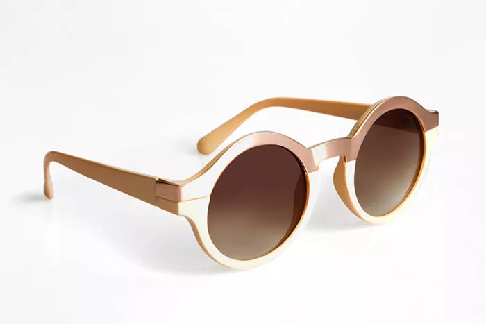
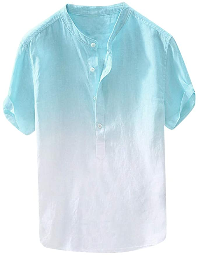
2020: the first year in history that more products were bought online than in brick-and-mortar stores. With so much competition online, great product photos are more important than ever! Here are 5 photo techniques to make your brand stand out and create shareable, engaging content.
White background
The classic white background photo is the most popular product photography technique – and for good reason. Used for 76% of Amazon products, this clean, versatile background appeals to all kinds of shoppers, and gives the illusion that your product is floating, as well as drawing the eye to its features and design.
Keep it minimalist and use hanging photos rather than mannequins or complicated displays. Fish wire is often used to give the illusion that the product is “hanging” or floating, and adds a 3D affect. Use a white background which can easily be edited for maximum aesthetic potential.
If your product looks different from different angles, consider a series of photos – the “flat lay” (where your item lies flat on a surface), “worm’s eye” (taken looking up at your product), straight-on, and front ¾ view are all good options. Arrange your product in a way that focuses on its great design and features.
For product lines, or products available in a range of different styles or colours, consider a group photo. This shareable “family photo” showcases your branding and promotes the full range all at once. Bonus: this is a great way to highlight any style or feature differences.
If your product is associated with a lifestyle like fitness, consider a photo of the product “in-action” or worn by a model who represents your customer base. This shows shoppers what the product looks like “in use” and gives them a clearer idea of the style and shape.


